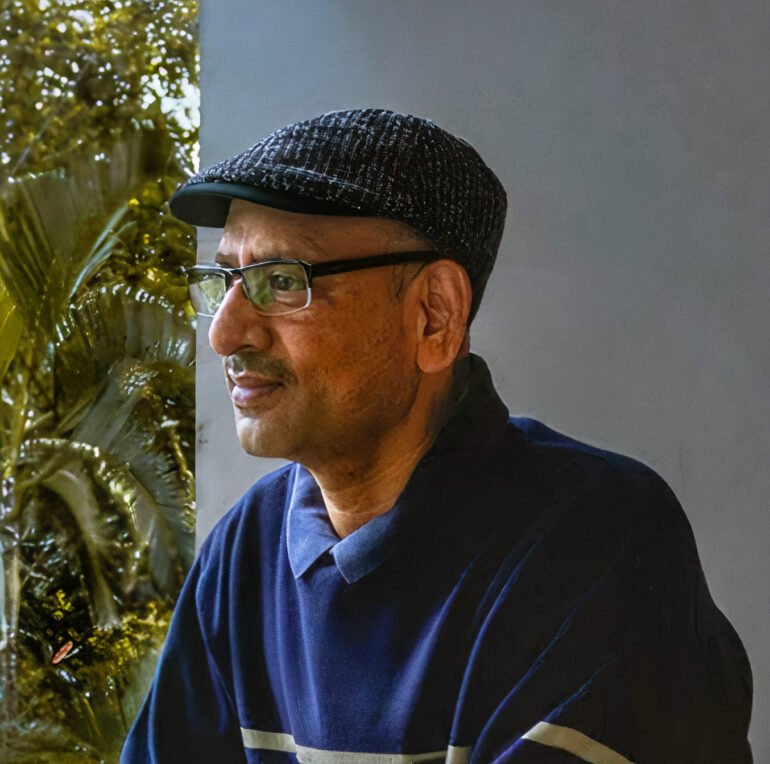
A data enthusiast who decided to gather numbers since the breakout of the very first case of COVID-19 in the Ballari District. A diligent and assiduous man who has got all the numbers that one might need to have a complete picture of how many cases were recorded, how many deaths occurred, and the number of recovered patients. Mr. Shashidhar Pathikonda has been doing this commendable work all by himself.
Mr. Pathikonda is a 55-year-old Mechanical Engineer and a Master of Science in Industrial Engineering who has been working as a partner member in a private firm. He started collecting COVID-19 data of the Ballari district since late March 2020.
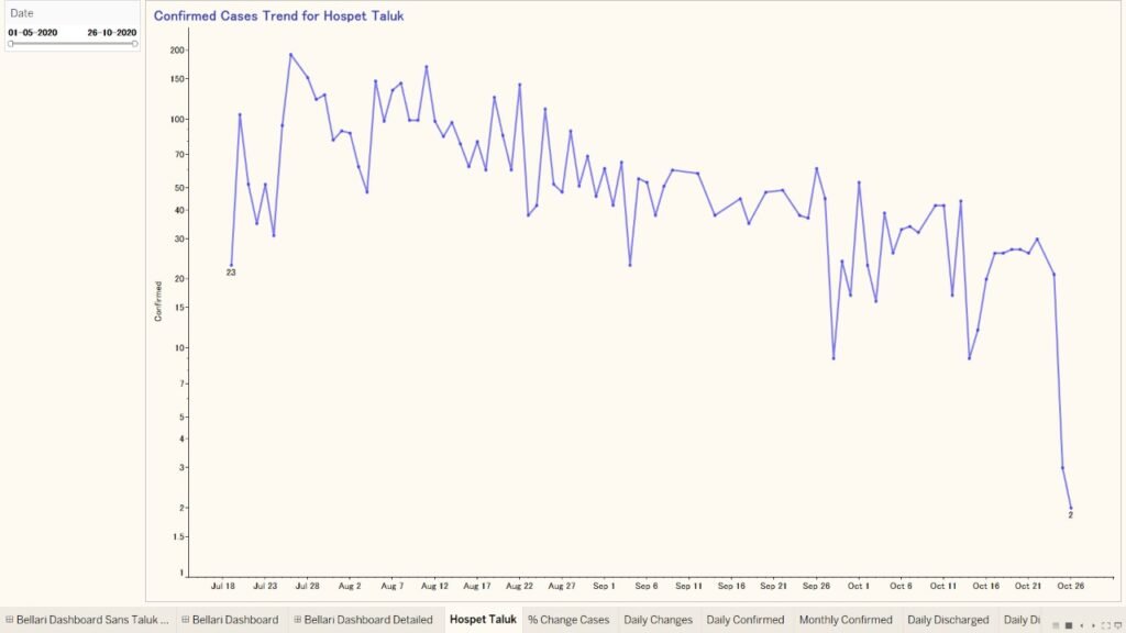
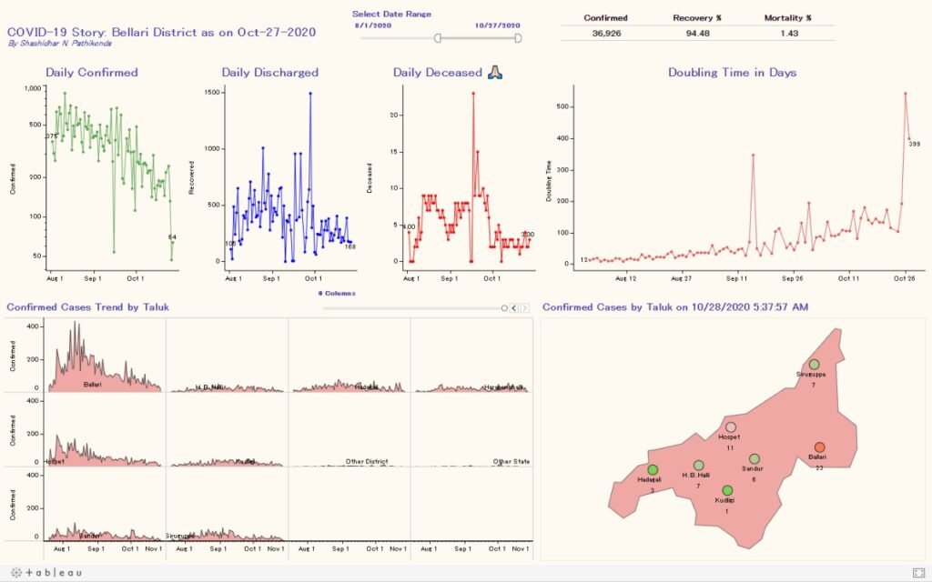
He decided to learn the Tableau software (Tableau is a data visualization software that is used for data science and business intelligence), all by himself, and started to compile the database and then developed the visualizations. He has not just made the tableau of the district but has also created such visualizations for India (by each state) and World (by each country). Some of his works using tableau software is attached below.
Hospet.online dug up some more information from Mr. Pathikonda to get a full insight into his work.
Here are some Q&A’s below.
Read on…
What do you think about the stats on Covid? Could it be better? What are your thoughts on the current situation?
“The daily Covid-19 stats provided by Hospet.online team is good and it provides a macro view. I would have liked to receive stats at a micro level to include age, gender, city/village, locality, and if the patient had any comorbidities. This would have helped in gaining more insights into the Covid-19 trend, what actions the authorities could/should have taken in better managing the spread. Since September 2020, the number of cases has shown a slow reduction. Given the resurfacing of Covid-19 cases across Italy, Spain, Poland, France, etc., there is a good possibility of Covid-19 resurfacing in India too. We should still continue with our efforts to wear masks, maintain social distancing, and washing our hands frequently.”
He believes that with the onset of winter in India, the cases are expected to rise in India. An unprecedented relaxation of preventive measures could lead to an increase in the number of COVID-19 cases.
How did the thought of gathering the data strike you?
“During the month of March 2020, I was watching the daily news brief about Covid-19 by ICMR on TV. These stats were at the India level, but I wanted to gather similar stats for the Ballari district and develop data visualization to gain insights. With the available data from Bellari district authorities, I have been providing the visualization on a daily basis. I share these data visualizations with my community, i.e., family, few friends in Hospet, and other friends from Hospet who have now settled in Bangalore, Dubai, Singapore, and the USA. They are happy to see the progress made by the Ballari district in terms of containing the spread of COVID-19 cases so far.”
What was the intention behind having the count of COVID patients?
“I took a keen interest in developing the data visualizations, because of the way the human brain processes information. Using charts or graphs to visualize large amounts of data is easier than going over excel spreadsheets or reports. Data visualization can also help in better analysis, identifying areas that need attention or improvement, and can take quick action by identifying patterns.”
How hard was it to get the data from the ground level?
“Initially, it was very hard to gather data from one source. It took quite a bit of researching to narrow down and typically depend on a reliable data source. I use GitHub, Ministry of Health and Family Welfare, and data published by Hospet.online on a daily basis to give the visualizations.”
If not this? What else would you’ve done in the lockdown
“Apart from learning Tableau, I spent quality time with my family and I read some good books, i.e., ‘Who Will Cry When You Die? ‘and ‘Tuesdays with Morrie‘. “
Mr. Pathikonda has also been actively contributing to Google Local guides and Google Maps over the past two years. He added new places, added travel pictures, restaurants, retail showrooms, tourist destinations, and many more. Mr. Pathikonda is also a photography enthusiast. Here are some of his astounding clicks.

A beautiful picture of a flower captured by Mr. Pathikonda 
Another eye-captivating picture

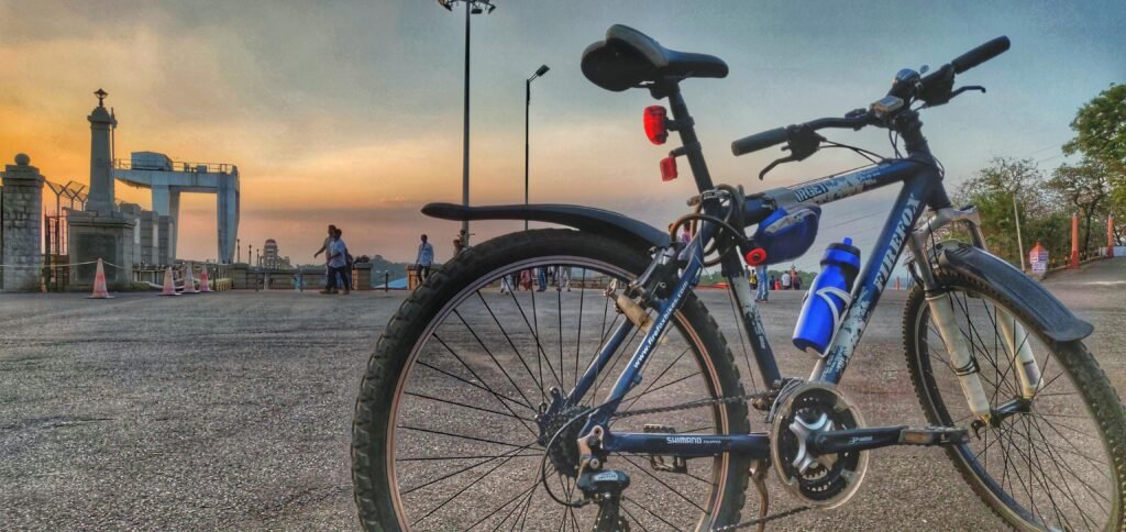
An alluring picture of the sunset from Tungabhadra Dam

Whispering stones at the iconic Hampi
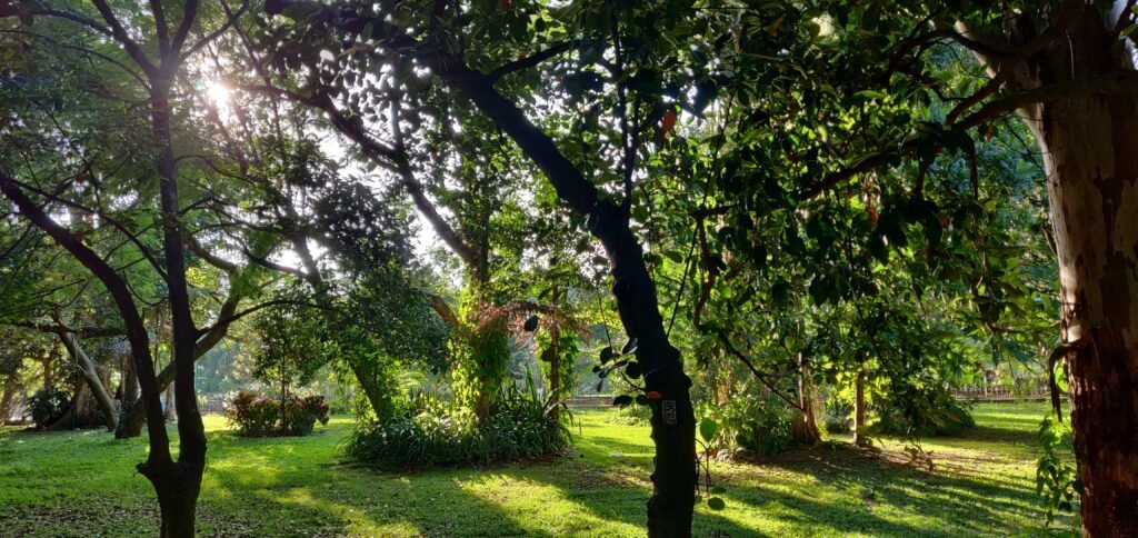
A view from Cubbon park
Mr. Pathikonda has proved that it’s not necessarily the job of the government to take up every responsibility, but the prime duty of every individual in the hard times of the pandemic to act responsible enough and to be equally capable and be strong mentally and physically. Hospet.online is profoundly thankful to Mr. Pathikonda for carrying out this commendable work on behalf of all the people from the Ballari district. We definitely need more people like him.
If you are someone who has done any kind of commendable work that has to be known by the people out there, or if you know someone whose work needs appreciation, Please contact us
Hospet.online is here delivering your stories to the people who are belonging to places in and around Hosapete.